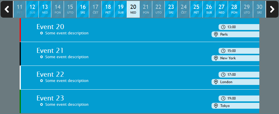
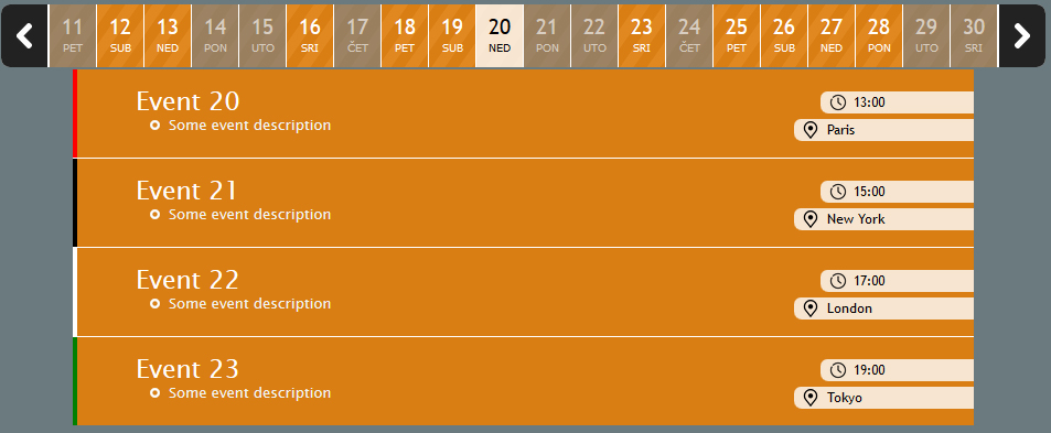
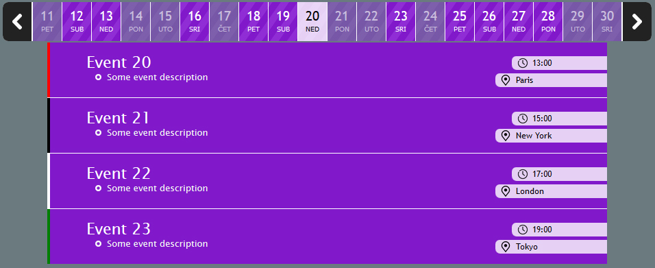
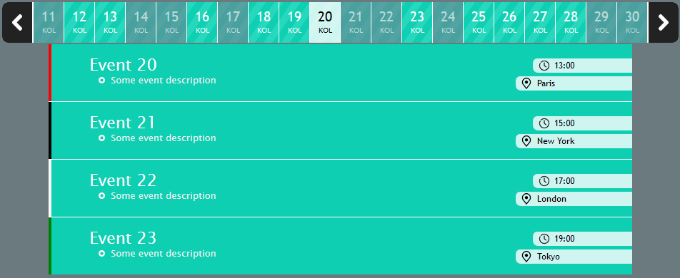
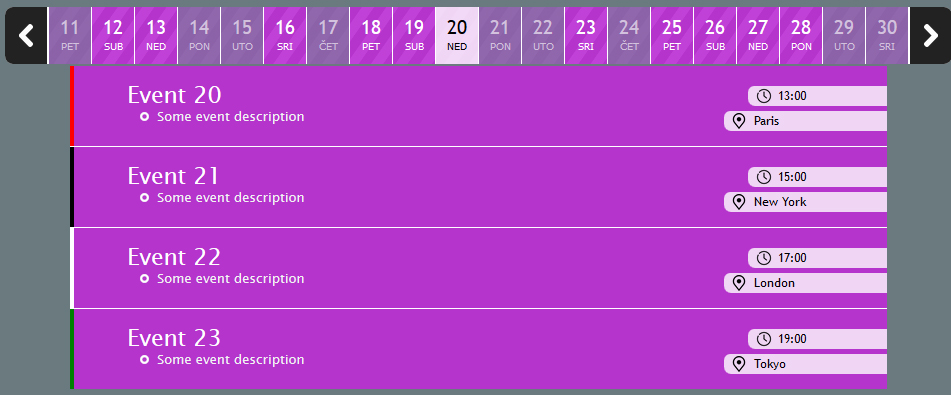
Event scheduler
12
Sun
13
Mon
14
Tue
15
Wed
16
Thu
17
Fri
18
Sat
19
Sun
20
Mon
21
Tue
22
Wed
23
Thu
24
Fri
25
Sat
26
Sun
27
Mon
28
Tue
29
Wed
30
Thu
31
Fri
1
Sat
2
Sun
3
Mon
4
Tue
5
Wed
6
Thu
7
Fri
8
Sat
9
Sun
10
Mon
11
Tue
12
Wed
13
Thu
14
Fri
15
Sat
16
Sun
17
Mon
18
Tue
19
Wed
20
Thu
Fully responsive

The compontent is fully responsive. No matter if you have a small resolution or a large one, the component will resize so that it provides all the functionality.

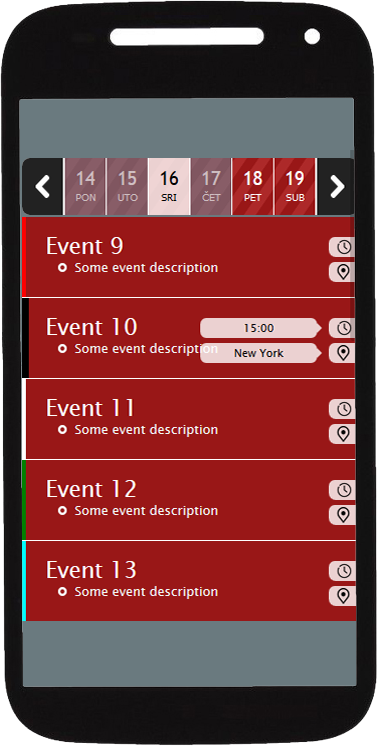
The difference between big and small resolution is that instead of the time and place box, you only see a clock and place icon over which you have to hover or click in order to see the time and place.

To enable the responsive mode on devices, inside your html document you need to declare the viewport. The default settings will be provided below on how to implement the component.
Adjustable width
You can easily adjust the width of an instance of the component so it fits anywhere! The width of the compontent can be set through various ways however it's important to note that the width also depends on the number of dates shown in the datebar. If the set width is wider than the number of dates then the desired width will be cut.

You can set the width to be in pixels or percentage. If you don't want to bother with the width, you can set it to 'auto' so that the component calculates width itself which means that all dates will be shown. If the width is not wide enough to cover all the dates in the datebar, you don't have to worry because you can either use mouse wheel or arrows to scroll.
8 COLOR LAYOUTS
HIGHLY CUSTOMIZABLE - FIELDS EXPLINATION
  • Beginning date is used to determine the begging date in the scheduler. You can either use an integer or a specific date. For an example, -3 would mean that the scheduler will also show 3 dates before today's date. 0 in this case means that the first date to be shown in the scheduler is today. 3 would obiviously mean that the scheduler dates starts 3 days from today. You can also use a specific date to set the first shown date in the scheduler. The correct format is yyyy-mm-dd (2017-03-12).
  • Number of dates is a number of dates to be shown in the datebar. If width is not wide enough to cover all date boxes, you can use mousewheel or arrows to see the rest.
  • Width represents the width of an instance of the component. If the width is set wider than the number of date boxes (one date box is 47px wide) then the width will be cut. You can specific width in various ways. First you can use 'auto' which sets the width same as the number of date boxes so that all dates are shown. Next to that you can use a number in pixels (500px). You can also specific width in percentage (50%). Both to percentage and pixels, you can add sufix ' - auto' in order to estimate the width to the closest width so that none of the date boxes is cut half. Example of that would be: '350px - auto' or '60% - auto'.
  • Alignement is the alignment of the component. Possible inputs are: left, center or right.
  • Enable arrows determines whether arrows should be shown or shouldn't be. As the component uses the mouse wheel plugin, this is not necesarry but keep in mind that mobile devices do not have mouse wheel therefore arrows should be used to scroll the dates.
  • colors define the layout. overlay is the color of the datebar and the events. arrows is the color of the arrows and defaultEventLine is the color of the line on the left side of an event if lineColor is not defined for a specific event.
  • Date-type relates to the text below the day (number) of a month. It can either show the short name of a month (JUL, AUG, SEP...) or the day in a week (FRI, SAT, SUN). You can also show both in which case an animation would be shown as a switch. The options are: days, months and days&months.
  • Date-type flash interval is related to 'both' option of the dateType setting. The number determines how many seconds should pass before switching the text below the date number.
  • Localization is also related to the dateType setting. It specifies language in which either the day in a week or a name of a month will be shown. It uses country ISO code as an input (en-US, de, hu, hr, pt...). However, if you set an invalid ISO code, the language used will be different for every user depending on their language preferences of their browser.
  • Differ date with events is an option used to differe the date boxes in the datebar depending if a specific date has an event or doesn't. Value true represents to differe dates depending on the number of events while value false makes no difference to the date boxes.
  • Enable mouse scrolling is an option to enable mouse scroll within the dates container (same functionality as arrows).