


This provides the familiar touch gestures for zooming content in mobile devices.

This plugin can adapt to any screen size so you will have an optimal viewing experience whether you are using desktop or mobile devices.

Using IOS, Android, laptops, desktops or even an old browser such as IE9 should be no problem with this plugin.
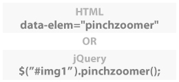
HTML beginner or hardcore jQuery developer? It doesn't matter because all you need is a single line of code of either JS or HTML and everything works automatically.

This plugin allows developers to have more control using the PinchZoomer API.

Add multi-touch zooming capability to as many content as you want in one page.


Different elements like images, text, etc can be placed inside a DIV and be zoomed.


Identify parts of your content with markers. Great for maps, floor plans or even products.


Small screen devices need all the space they can get. This gives an option to the user to view the content without the clutter.


Prevent unnecessary load time, resources and lag by delivering the correct image size to any screen size.
<div class="zoomHolder">
   <img data-src="assets/easter_chick.jpg" data-elem="pinchzoomer"/>
</div>
CSS
.zoomHolder
{
   width:100%;
   height:auto;
   position:relative;
   overflow:hidden
}
<div class="zoomHolder">CSS
<div data-elem="pinchzoomer">
<img id="streetLayer" data-src="assets/street_layer.jpg" data-elem="bg" class="layerImg"/> <img id="buildingLayer" data-src="assets/detail_layer.png" class="layerImg"/> </div>
</div>
.zoomHolder
{
   width:100%;
   height:auto;
   position:relative;
   overflow:hidden
}

.layerImg
{
   position:absolute;
   left:0px;
   top:0px;
   right:auto;
   bottom:auto;
}
<div data-elem="transformPreset" data-options="id:cb; transformOrigin:50% 100%"></div> <div class="zoomHolder">CSS
<div data-elem="pinchzoomer">
<img data-src="assets/flower_and_bee.jpg" data-elem="bg"/>
<img data-src="assets/bee_marker.png" class="marker" data-elem="marker" data-options="x:240; y:100; transformOrigin:cb; maxZoom:1.5"/>
<img data-src="assets/flower_marker.png" class="marker" data-elem="marker" data-options="x:450; y:260; transformOrigin:cb; maxZoom:1.5"/>
<img data-src="assets/wings_marker.png" class="marker" data-elem="marker" data-options="x:250; y:100; transformOrigin:cb; minZoom:1.6"/>
<img data-src="assets/legs_marker.png" class="marker" data-elem="marker" data-options="x:300; y:165; transformOrigin:cb; minZoom:1.6"/>
<img data-src="assets/disk_marker.png" class="marker" data-elem="marker" data-options="x:280; y:270; transformOrigin:cb; minZoom:1.6"/>
<img data-src="assets/petal_marker.png" class="marker" data-elem="marker" data-options="x:90; y:190; transformOrigin:cb; minZoom:1.6"/>
</div>
</div>
.zoomHolder
{
   width:100%;
   height:auto;
   position:relative;
   overflow:hidden
}
.marker
{
   position: absolute !important;
   left: 0px !important;
   top:0px !important;
   bottom: auto !important;
   right: auto !important
}

This example shows a how easy it is to convert PinchZoomer to a product gallery with thumbnails and hotspots using the API.

This shows how to integrate Masonry plugin with a fullscreen PinchZoomer gallery.
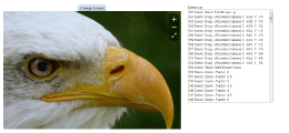
This example shows the events that are fired.
